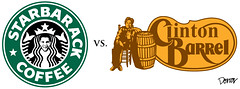
Starback coffee & Clinton Barrel & logo spoof--
Adbusting at its best...
Thursday, October 16, 2008
Saturday, July 19, 2008

Wednesday, June 18, 2008
Olympics 2016, Pick your city


- The International Olympic Committee (IOC) selected these 7 Cities as potential candidates to host the 2016 Olympic and Paralympic games.
- Which city will become the next Host City of the Olympic and Paralympic Games?
- The IOC will select the Host City on October 2, 2009, in Copenhagen.
Representing the nominated cities for 2016 Olympic Games (Oh Gosh! that seems so far...), the use of the infamous Olympic rings symbolising the continents is not permitted till a city is nominated; hence, the absence of It---in case you were wondering, now you know... that these design were submitted before the news of their candidature. Now, the rings can be added...
So, which logo would you pick, if it was you who'd be the one to pick?...
Chicago?! Hmmm...Doesn't mean much; doesn't mean more than a reflection of the city itself, its skylines; as for the star, it means so many things that it ends up meaningless...
Love type and calligraphy so love Doha’s logo event though, many might say that it can't be of a good fit with the Olympics, but then, why not, yeah why not?... The calligraphy actually reads the word Doha in Arabic, from bottom right to left in a semi-circle; am also able to read the word Olympiad as a whole for all the designed lettering, but hey not so certain; Will ask around, who sees or reads what... I heard Fitch is behind the ident, however, the info hasn't been confirm yet...Will soon...
Praha logo contains all 5 olympic colours and features an olive branch, an iconic symbol, in reference probably to ancient Olympiad, Roman times and era , great symbolism in here, if so is the case!
I like Baku cuz i feel some the vibes and one hell of a dynamism pouring within...The logo inspires joy, enchantment, some sort of a healing dance...Bizarre... A vivid interest toward Azerbaidjan has been triggered. Not sure it connects well though with the Olympics though...It depends all on how the rings are to be inserted in here.
Tokyo’s is not so bad at all, looks pretty good, feels pretty good too, Niko, c'est bo!bo!
5 stars for Rio, as the designer has smartly embedded the sun [yellow], the mountains [green] and on the left side the oceans [blue]; of course, only when icon is viewed in 3D perspective;
Madrid is the finger to who knows...But hey, isn't the middle finger a bit out of place? Also, that hand looks much like the one of Dubai Cares organisation...
==============================================================================================
Baron Pierre de Coubertin, the French educational reformer who founded the modern Olympic Movement in 1894, was very passionate about design and took a personal interest in ensuring that the imaging tradition of the Olympic Games advanced along with the sports tradition.
In 1913, he designed the Olympic rings and introduced them on a white flag at a meeting of the International Olympic Committee in Paris. The five interlocking rings represent the bond of friendship established between the five continents (the number recognised at the time), as they join in the celebration of the Games.
The colour palette—blue, black, red, gold and green rings plus the white background—reflect at least one color found in the flags of every nation on earth.
Today, the Olympic rings are one of the most recognised and admired symbols around the world—and research has shown that they still stand for friendship and peace through sport.
Tuesday, June 17, 2008
Branded Voyage

“These are the tourism brands from some countries from all over the world.
Symbol, colours, arrangement, form and typography are elements that can play a role in defining an ownable and memorable brand identity. This sounds straightforward, but many countries with a variety of destinations or rich cultural or geographic assets can’t easily be depicted through one specific icon. Natural characteristics, regional animals or architectural landmarks may not serve as a comprehensive symbolic representation of a nation and all that it offers. Perhaps this is why some countries, as seen in this range of brands, default to their national flag or other abstract elements to create a sense of distinction."
Read more here
Wednesday, April 30, 2008
Corporate Alphabet for Aliens like us
Logos are being used as letters, hinting at the massive visual memory that we the humans have, which allow us to grasp, register, archive so many images..
Try guessing what is the brand that equals each of the 25 letters...
We bet you can relate every one to its corporate umbrella--
Try guessing what is the brand that equals each of the 25 letters...
We bet you can relate every one to its corporate umbrella--

Corporate Alphabet, Arnoud van den Heuvel, Koert van Mensvoort, 2005.
Sunday, March 23, 2008
Global brands gone Mad

This pair of maps show the global presence of Starbucks coffee shops and McDonald's restaurants.
When examined graphically, both companies act as global hubs that connect some of the world's poorest, most remote countries with some of the wealthiest.
Map to Contemplate...
When examined graphically, both companies act as global hubs that connect some of the world's poorest, most remote countries with some of the wealthiest.
Map to Contemplate...
Saturday, February 9, 2008
Do you wear, eat, touch, love your brand??

When a Brand Speaks with a Customers Voice
"Conversations swirl around the touchpoints of a brand. We mention our favourite brands over lunch, we wear them, carry them and sometimes even drive them. And what makes their study so fascinating and the demands of their stewardship so challenging is that they can and do embed themselves very deep in the human psyche..."
Continue Reading at Servant Of Chaos...
Continue Reading at Servant Of Chaos...
Friday, February 8, 2008
Please take my brand to Europe

[...] Creatives and strategic planners need to understand what they have to consider when their client pops the question, ‘Please take my brand to Europe.’ They have to understand what cultural differences affect the creative streams; what the media consumption patterns are; who's open to innovative creative work and who's not; how media and creative regulations may differ between EU countries; but most of all, they have to understand the 'Euroconsumer' - a spoiled consumer living in a highly-developed market, used to choosing his communication channels, having access to broad choice, being fragmented in terms of brand (and media) consumption, used to creative advertising and bored by some [...]
Erik Saelens, Founder, CEO - Brandhome
will provide the creative vision on how to conquer Europe.
Monday 31 March
What MENA/Indian Creatives Should Know When Bringing Their Brands To Europe
16:00 - 16:45
Sheikh Rashid Hall
Monday 31 March
What MENA/Indian Creatives Should Know When Bringing Their Brands To Europe
16:00 - 16:45
Sheikh Rashid Hall
Saturday, February 2, 2008
Double C

Designed by Coco Chanel, the interlocking Cs first appeared on the lid of Chanel No 5 perfume bottles in 1921.
They have remained a quintessential part of the brand ever since, as classic and elegant as the company they were chosen to represent[...]
...First used in haute couture in 1959 when it appeared on the buttons of a Chanel suit,
it has also appeared inside the brand's classic bag, designed in 1955,
and was added to the item's clasp following Coco's death in 1971.
Read full article by Mark Hughes in The Independent
Ronald's Brand

The McDonald's 'Golden Arches'
First mooted by the McDonald's co-founder Dick McDonald in 1952,
the arches would not go on to become the company's official logo for another 10 years.[...]
.....Fred Turner first sketched a new logo, a stylised "V".
Then Jim Schindler, McDonald's head of engineering and design, sketched a logo
that pictured the slanting roof of the restaurant piercing a line
drawing of the golden arches in the form of an "M".
The "Golden Arches" were born. In 1968, the roof line image was dropped
and the McDonald's name added to derive the current logo.
Read full article in The Independent & check the copycat logo here
Logo expert Andy Payne, said:
"The interesting thing about this logo is that it was born of architecture. The arches were a design to be used in a building and that has created the unique nature of the "M". It does rely on colour, in that you might not recognise it as McDonald's if it was not yellow and red."
Job's Apple


The Apple apple
First designed by the current Apple CEO, Steve Jobs,
the IT giant's original logo was completely different from the one we know today.
It depicted Sir Isaac Newton sitting below a tree with an apple falling on his head a tribute to his discovery of gravity.
That logo was replaced in 1976 by a rainbow-coloured silhouette of an apple with a bite taken out of it,
an idea dreamt up by the graphic designer Rob Janoff, which was to remain the same until 1999
when Apple began using a monochrome logo.
The urban myth says that the bitten apple is a reference to Alan Turing, the pioneer of the Enigma code and "father of the computer", who committed suicide in 1954 by taking a bite from a cyanide-laced apple.
Janoff insists that the apple simply represents knowledge.
In 2006, the logo was at the centre of a court dispute between the computer company
and the Beatles' Apple Corps label, which uses an apple as its logo.
Logo expert, Andy Payne, creative director of Interbrand says:
"Again it's an example of a really successful, yet simple, logo."
Via The Independent By Mark Hughes.The last visual is designed by South African, Vincent Raffray, Creative Director & Partner at Tonic Communications, an indepentent Ad agency based in Dubai.
As for the rest, I can't remember which agency is behind the design, but will, soon Inshallah.
Branding is a whisper
Advertising is a shout. Branding is a whisper.
Shhhh. Longtime futurist and author Faith Popcorn warns that optimism is passé and brands that trumpet their benefits are hopelessly out of tune with consumers who are sick and tired of marketing's noise.
The founder of 33-year-old consultancy BrainReserve, Popcorn explains why she advises marketers such as Target, GE, McDonald's, Tylenol and Nabisco to build their strategies around whispers and honesty rather than hype and shouts.
But is asking brands to act softly asking too much?
Read more in ADWEEK
Sunday, January 20, 2008
iPhone:the untold story
 It was a late morning in the fall of 2006.
Almost a year earlier, Steve Jobs had tasked about 200 of Apple's top engineers with creating the iPhone.
Yet here, in Apple's boardroom, it was clear that the prototype was still a disaster. It wasn't just buggy, it flat-out didn't work.
The phone dropped calls constantly, the battery stopped charging before it was full, data and applications routinely became corrupted and unusable. The list of problems seemed endless.
At the end of the demo, Jobs fixed the dozen or so people in the room with a level stare and said, "We don't have a product yet."
Read "The Untold Story: How the iPhone Blew Up the Wireless Industry" from Wired
Friday, January 18, 2008
Brand Hijack


Usurping the original logo, to grab attention, is a familiar means of making a social statement
usually adressed to raise awarness around consumerist capitalit unscrupulous corporations -
It is the nexus of Art & Socio-Political design;
it's humour used as a social weapon.
And it's funny!!
For more parody of Super Brands, and if you feel like cracking up
Click HERE
or
I SPOOF
Wednesday, January 9, 2008
Beer, Wit & Sheers


Almaza is Lebanon’s premier local beer. Its fresh taste, long history, solo market performance and playful communication helped it gain the coveted status of "lovemark" among most nationals.
Agency: Intermarkets, Beirut
Regional Creative Director: Assaad Doueihy
Art Director: Elie Bou Najm
Group Account Director: Sara Assaf
Account Manager: May Nasrallah
Almaza won the Pikasso D'or 2006
*The notes are excerpted from ArabAd magazine - February issue 07, in brands section [page 114-117]- written by Ibrahim Nehmé
Full article will be published soon on ArabAd mag site -
CHECK MORE ADVERTISING FOR ALMAZA BEER,
GO TO ARABAD MAGAZINE CREATIVE ARCHIVE FOR ADVERTISING IN THE MIDDLE EAST--
Brand leader on its own, Almaza is so deeply rooted in the Lebanese "art de vivre" that the beer became an indisputable part of the country's legacy and culture to the point that an anecdote --if not a deep belief -- often shared, claims that the missing link for a tourist who doesn't get a sip of Almaza, would make his travel experience simply incomplete.
The brand is indeed a source of national pride, and drinking Almaza has become a clear statement that supports Lebanese products.
The brand is indeed a source of national pride, and drinking Almaza has become a clear statement that supports Lebanese products.
But behind such a ‘patriotic branding strength’ lies a growing brand value with a global potential imparted essentially to a market presence that dates back to the 70's.
However, when a brand evolves within a market in total ‘monopoly’ powered by unrivalled distribution channels and a good product, a company ends up not only communicating its brand as the most powerful in the market, but also living a dream that every business enterprise would want to enjoy.
This is Almaza's living marketing fairy tale that succeeded in its embodiment onto Lebanese core local culture and faceted genuine identity.
Almaza ads are reputed attention grabbers and are usually
preceded by teaser campaigns that create a very successful
momentum of word-of-mouth,
The brewery was founded by the Jabre family in 1933 in Bauchrieh, Beirut. It started as a small ambitious project producing 1000 bottles/hour with a total capital equalling 30,000 LBP.
Today, Almaza manufactures 24,000 bottles/hour and its capital is worth 35 billion LBP.
On September 18, 2002, Heineken, the global beer manufacturer, bought Almaza.
Many entrepreneurs like to build their brands and then sell them after several years at a profitable price, which results from the increase in brand value. The entrepreneurs behind Almaza did the
same with the difference that the brand was 70 years old.
Does the notion of entrepreneurship 101 that a brand is sellable after years
of success hold true for brands that have been so long in the market?
Of course it does. But does this reasoning apply for a brand like Almaza? Have the company’s management broken the brand promise by selling this ‘local hope’ to a foreign conglomerate?
What is it that still prevents Lebanese brands from going global?
Why is it that anytime a local brand reaches the middle of the ladder to globalisation, the ladder breaks and the brand is doomed to function among the boundaries of its home country?
While we don’t have any final answer to these questions, let us hope that we can identify the symptoms and change this reality as soon as possible.
Although Heineken’s acquisition can only indicate that Almaza is an attractive brand with unmatched distribution networks, and Heineken was willing to pay any price to buy the fierce local rival
and its supply channels; however, this is not our vision of conquering the world via our Lebanese brands.

Agency: Intermarkets, Beirut
Regional Creative Director: Assaad Doueihy
Art Director: Elie Bou Najm
Group Account Director: Sara Assaf
Account Manager: May Nasrallah
Almaza won the Pikasso D'or 2006
According to the ‘Beer Lover’s Rating Guide’ by Bob Klein, Almaza is regarded as one of the best pilsener beers in the
world. The guide describes the drink as ‘sharp, crisp, and to the point, with a faint hint of mustiness.
The author also comments that he liked the beer a lot and that the 9.5 ounce bottle isn’t enough to ‘let you fully enjoy its tantalizing delights’.
This is a testament to the fact that Almaza was built on a strong base with a sustainable competitive advantage that
competitors can’t easily imitate.
*The notes are excerpted from ArabAd magazine - February issue 07, in brands section [page 114-117]- written by Ibrahim Nehmé
Full article will be published soon on ArabAd mag site -
CHECK MORE ADVERTISING FOR ALMAZA BEER,
GO TO ARABAD MAGAZINE CREATIVE ARCHIVE FOR ADVERTISING IN THE MIDDLE EAST--
Subscribe to:
Posts (Atom)

