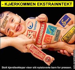
An image of a branded infant that illustrates how great is the human species, or better how funny we have become as natural born brand victims; brainwashed with corporate values, walking through life with nothing more solidly anchored than our capitalist values...
Time to take action, time to re-think our earthy journey & practice "The Power of Less" as preached by Leo Babauta.
Cheers & happy New Fears...
Monday, January 12, 2009
Thursday, October 16, 2008
Saturday, July 19, 2008

Wednesday, June 18, 2008
Olympics 2016, Pick your city


- The International Olympic Committee (IOC) selected these 7 Cities as potential candidates to host the 2016 Olympic and Paralympic games.
- Which city will become the next Host City of the Olympic and Paralympic Games?
- The IOC will select the Host City on October 2, 2009, in Copenhagen.
Representing the nominated cities for 2016 Olympic Games (Oh Gosh! that seems so far...), the use of the infamous Olympic rings symbolising the continents is not permitted till a city is nominated; hence, the absence of It---in case you were wondering, now you know... that these design were submitted before the news of their candidature. Now, the rings can be added...
So, which logo would you pick, if it was you who'd be the one to pick?...
Chicago?! Hmmm...Doesn't mean much; doesn't mean more than a reflection of the city itself, its skylines; as for the star, it means so many things that it ends up meaningless...
Love type and calligraphy so love Doha’s logo event though, many might say that it can't be of a good fit with the Olympics, but then, why not, yeah why not?... The calligraphy actually reads the word Doha in Arabic, from bottom right to left in a semi-circle; am also able to read the word Olympiad as a whole for all the designed lettering, but hey not so certain; Will ask around, who sees or reads what... I heard Fitch is behind the ident, however, the info hasn't been confirm yet...Will soon...
Praha logo contains all 5 olympic colours and features an olive branch, an iconic symbol, in reference probably to ancient Olympiad, Roman times and era , great symbolism in here, if so is the case!
I like Baku cuz i feel some the vibes and one hell of a dynamism pouring within...The logo inspires joy, enchantment, some sort of a healing dance...Bizarre... A vivid interest toward Azerbaidjan has been triggered. Not sure it connects well though with the Olympics though...It depends all on how the rings are to be inserted in here.
Tokyo’s is not so bad at all, looks pretty good, feels pretty good too, Niko, c'est bo!bo!
5 stars for Rio, as the designer has smartly embedded the sun [yellow], the mountains [green] and on the left side the oceans [blue]; of course, only when icon is viewed in 3D perspective;
Madrid is the finger to who knows...But hey, isn't the middle finger a bit out of place? Also, that hand looks much like the one of Dubai Cares organisation...
==============================================================================================
Baron Pierre de Coubertin, the French educational reformer who founded the modern Olympic Movement in 1894, was very passionate about design and took a personal interest in ensuring that the imaging tradition of the Olympic Games advanced along with the sports tradition.
In 1913, he designed the Olympic rings and introduced them on a white flag at a meeting of the International Olympic Committee in Paris. The five interlocking rings represent the bond of friendship established between the five continents (the number recognised at the time), as they join in the celebration of the Games.
The colour palette—blue, black, red, gold and green rings plus the white background—reflect at least one color found in the flags of every nation on earth.
Today, the Olympic rings are one of the most recognised and admired symbols around the world—and research has shown that they still stand for friendship and peace through sport.
Tuesday, June 17, 2008
Branded Voyage

“These are the tourism brands from some countries from all over the world.
Symbol, colours, arrangement, form and typography are elements that can play a role in defining an ownable and memorable brand identity. This sounds straightforward, but many countries with a variety of destinations or rich cultural or geographic assets can’t easily be depicted through one specific icon. Natural characteristics, regional animals or architectural landmarks may not serve as a comprehensive symbolic representation of a nation and all that it offers. Perhaps this is why some countries, as seen in this range of brands, default to their national flag or other abstract elements to create a sense of distinction."
Read more here
Wednesday, April 30, 2008
Corporate Alphabet for Aliens like us
Logos are being used as letters, hinting at the massive visual memory that we the humans have, which allow us to grasp, register, archive so many images..
Try guessing what is the brand that equals each of the 25 letters...
We bet you can relate every one to its corporate umbrella--
Try guessing what is the brand that equals each of the 25 letters...
We bet you can relate every one to its corporate umbrella--

Corporate Alphabet, Arnoud van den Heuvel, Koert van Mensvoort, 2005.
Sunday, March 23, 2008
Global brands gone Mad

This pair of maps show the global presence of Starbucks coffee shops and McDonald's restaurants.
When examined graphically, both companies act as global hubs that connect some of the world's poorest, most remote countries with some of the wealthiest.
Map to Contemplate...
When examined graphically, both companies act as global hubs that connect some of the world's poorest, most remote countries with some of the wealthiest.
Map to Contemplate...
Subscribe to:
Posts (Atom)

